How to make text readable over a photo (contrast, shadow and band)
Beautiful text nobody can read does not do its job. Over photos the problem shows up because the background shifts from light to dark inside the same sentence. The good news: there are simple fixes.
What contrast is and why it matters
Contrast is the difference in luminance between the text and what is behind it. Web accessibility guidelines (WCAG) use a contrast ratio: at least 4.5:1 for normal text and 3:1 for large text. Black on white is 21:1. White on light yellow is close to 1.1:1, nearly invisible.
How Edith helps
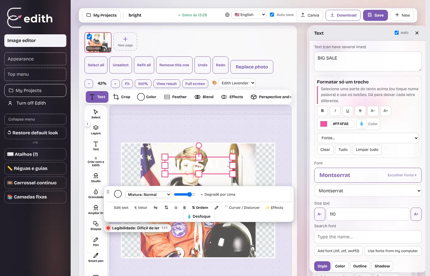
When you select a text in Edith, a Legibility badge appears with a grade (good, fair or hard to read) and the contrast ratio. The measurement runs in your browser: Edith looks only at the area behind the text and considers the hardest spots, not just the average. If the grade is poor, Edith warns you and offers one-click fixes.


The five most used fixes
- Darken the area behind the text with a soft transparent shade.
- Switch the text to white or black, depending on the background.
- Add a text shadow, good for mixed backgrounds.
- Put a band behind the text, the safest and most common solution for social covers.
- Make the font larger and bolder. Big heavy letters read better, and the requirement drops to 3:1.
Design tips
- Place text where the photo is calm: sky, wall or blurred background.
- Avoid thin decorative fonts over detailed photos.
- Test on a phone at small size: if you can read it squinting, contrast is good.
Ready to try it?
Edith is a free online image editor that runs in your browser, no sign-up.
Open Edith (free)